LEATHER LEATHER FURNITURE GALLERY • HIGH POINT MARKET NOTES
By Tricia Mulcahy | Interior Designer, Leather Leather Furniture GalleryA Warmer Approach to Neutrals
For me, this palette builds on the appeal of a neutral room while giving it more depth. Cream, oatmeal, mushroom, sand, and warm taupe provide a soft foundation. Alongside chocolate leather, chestnut wood, or a burgundy textile, those lighter shades feel especially inviting. The undertones matter. A creamy fabric can bring out the richness in brown leather, while a taupe rug can connect the upholstery with wood furniture. I like to view these materials together in the room’s lighting, because a neutral that looks warm in one setting may look gray or pink in another. The goal is a palette that feels connected without requiring every surface to match.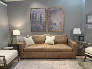
Rich Browns Give Upholstery a Strong Foundation
Chocolate, espresso, chestnut, caramel, and cognac each bring a different mood to upholstery. A deeper brown can give a sofa a substantial, grounding presence. A golden cognac can add light and warmth, particularly alongside textured fabrics and natural wood. Leather makes these differences especially interesting. Its grain, sheen, and finish influence how the color reads. I’m drawn to the combination of a rich leather sofa and fabric accent seating: the leather gives the room depth, while the fabric introduces softness and another texture. That mix also leaves room for rugs, artwork, and accessories to express more personality.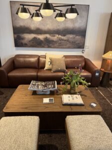
Burgundy Adds a Beautiful Layer of Color
Burgundy is a color I’m particularly drawn to within this warmer direction. It has enough depth to sit comfortably beside browns and wood finishes, yet it brings a distinct richness of its own. Wine, oxblood, and muted berry shades offer different ways to explore that family of color. In a living room, I might introduce it through an accent chair, a patterned rug, or a few carefully chosen pillows. In a bedroom, bedding offers an easy way to layer burgundy against cream upholstery and darker wood. Repeating a small amount of the color elsewhere—perhaps in artwork or a textile—can help it feel integrated into the room.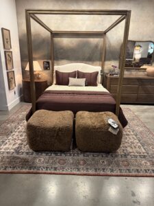
Rounded Designs Make Rooms Feel More Welcoming
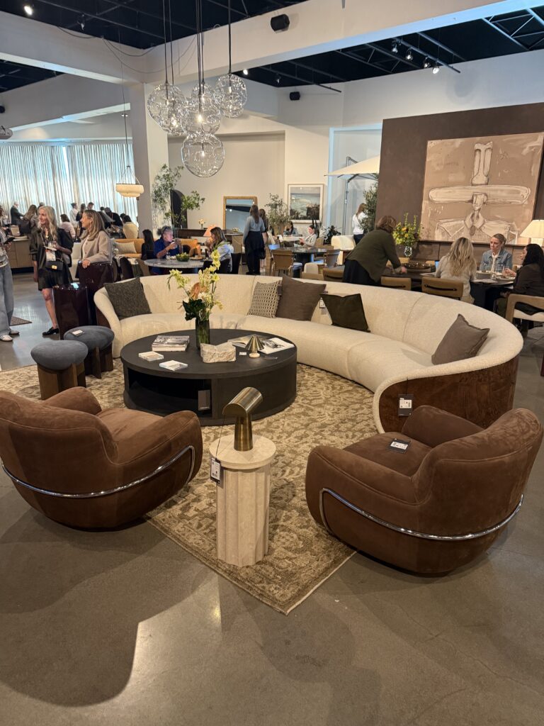
Curved sofa backs, rounded arms, enveloping chairs, and circular tables bring a softer rhythm to a space. What appeals to me is the way these forms relate to one another. A curved sofa can define a conversation area, while a pair of rounded chairs can make the arrangement feel more connected. There is room for balance here. A straight sofa can look beautiful with a round coffee table or a chair with a curved back. Mixing shapes allows individual pieces to stand out. I also consider how people will move through the room: a curved design still needs the right footprint, comfortable seat depth, and enough space around it.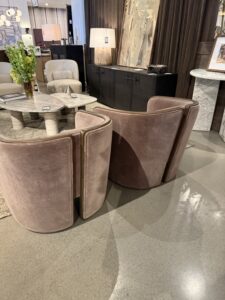
Texture Brings a Quiet Palette to Life
When colors are closely related, texture becomes especially valuable. Smooth leather, a woven fabric, a softly textured rug, and visible wood grain each catch the light differently. Together, they can give a room interest without demanding a bold pattern on every surface. I like to build these layers with everyday use in mind. Upholstery should feel good to touch and suit the household. Rugs should support the furniture arrangement, and decorative pillows should add something meaningful through color, texture, or pattern. Each choice contributes to how the room feels as a whole.Lighting, Tables & Accessories Complete the Room
My attention at Market extends to the pieces around the upholstery. Rounded mirrors, sculptural lighting, substantial tables, and warm metal finishes can reinforce the softness of the furniture. Stone surfaces bring another texture, while wood adds grain and warmth. Lighting is particularly important with deeper colors. I like a combination of table lamps, floor lamps, and overhead light so the room feels welcoming throughout the day. The aim is to illuminate the materials and create comfortable places to read, gather, and relax.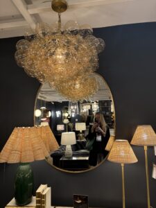
Comments are closed here.