LEATHER LEATHER FURNITURE GALLERY
How Fashion Color Trends Shape Our Homes
 Color inspiration in burgundy olive and ochre
How the colors we wear become the spaces we live in—and how to make them feel like your own.
A beautiful color rarely belongs to just one part of our lives. A burgundy handbag, a camel coat, a chocolate leather jacket, or an ivory knit can suggest the beginning of a room. We respond to the combination before we necessarily think about why it works.
As an interior designer and business owner at Leather Leather Furniture Gallery, I look at color trends as an opportunity to understand what people are drawn to and how they want their homes to feel. My goal is to translate that inspiration into furniture, materials, and combinations that will continue to feel right long after a particular season has passed.
Looking back over the past decade, I see a movement between restraint and expression: cool neutrals and soft pastels, confident accents, nature-inspired palettes, and the deeper warmth that makes browns, burgundies, and layered neutrals so appealing today. These directions overlap. They are a design perspective on the decade, rather than a rule about what every home looked like.
 From fashion accessories to leather and fabric selections
Fashion gives us a relatively immediate way to experiment. A scarf or jacket introduces a new color without requiring us to rethink everything we own. Interiors often ask for a longer commitment, especially when the choice is a sofa or a roomful of upholstery.
Fashion is an important driver of interior color trends. Colors gain visibility through runway collections, clothing, handbags, and accessories, then evolve into the fabrics, leathers, rugs, and finishes we select for our homes. The transition is not always immediate or uniform, but fashion helps establish a visual direction that interior designers and home furnishings manufacturers interpret for longer-lasting use.
The translation is also about texture and shape. A softly tailored wool suit might suggest a heathered upholstery fabric with clean seams. A caramel leather bag might inspire a cognac chair beside walnut furniture. A rich burgundy velvet can bring the depth of an evening jacket into a reading corner.
Benjamin Moore made that connection explicit when announcing its 2026 Color of the Year, Silhouette AF-655. The company linked its espresso-and-charcoal shade to classic suiting and renewed interest in timeless silhouettes and the brown color family.
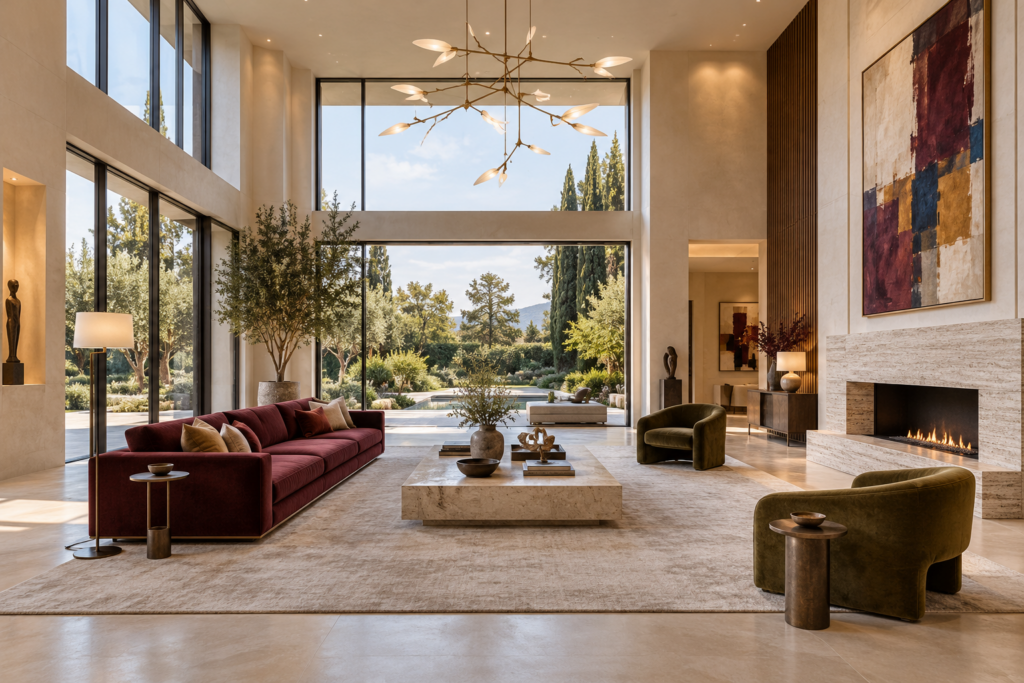
 Burgundy and olive upholstery in a refined contemporary living room
A sofa or sectional occupies a substantial part of the view and sits where we spend time. Its upholstery becomes part of both the visual atmosphere and the physical experience of the room.
Color alone cannot tell the whole story. Chocolate leather has a different presence from chocolate velvet. An ivory woven fabric reads differently from smooth ivory leather. Leather grain, sheen, fabric pile, stitching, and the scale of the furniture all influence how the color feels.
The same is true of shape. Burgundy on a softly curved chair can feel enveloping. On a slim, tailored frame, it can feel crisp and deliberate. A warm neutral on a broad sectional creates a different balance from that same neutral on a small exposed-leg sofa.
That is why I prefer to choose upholstery within the whole room: flooring, wood tones, rugs, lighting, art, and the way the furniture will actually be used. The most successful selection supports both your design direction and your daily life.
Color inspiration in burgundy olive and ochre
How the colors we wear become the spaces we live in—and how to make them feel like your own.
A beautiful color rarely belongs to just one part of our lives. A burgundy handbag, a camel coat, a chocolate leather jacket, or an ivory knit can suggest the beginning of a room. We respond to the combination before we necessarily think about why it works.
As an interior designer and business owner at Leather Leather Furniture Gallery, I look at color trends as an opportunity to understand what people are drawn to and how they want their homes to feel. My goal is to translate that inspiration into furniture, materials, and combinations that will continue to feel right long after a particular season has passed.
Looking back over the past decade, I see a movement between restraint and expression: cool neutrals and soft pastels, confident accents, nature-inspired palettes, and the deeper warmth that makes browns, burgundies, and layered neutrals so appealing today. These directions overlap. They are a design perspective on the decade, rather than a rule about what every home looked like.
How Fashion Finds Its Way Into Our Homes
From fashion accessories to leather and fabric selections
Fashion gives us a relatively immediate way to experiment. A scarf or jacket introduces a new color without requiring us to rethink everything we own. Interiors often ask for a longer commitment, especially when the choice is a sofa or a roomful of upholstery.
Fashion is an important driver of interior color trends. Colors gain visibility through runway collections, clothing, handbags, and accessories, then evolve into the fabrics, leathers, rugs, and finishes we select for our homes. The transition is not always immediate or uniform, but fashion helps establish a visual direction that interior designers and home furnishings manufacturers interpret for longer-lasting use.
The translation is also about texture and shape. A softly tailored wool suit might suggest a heathered upholstery fabric with clean seams. A caramel leather bag might inspire a cognac chair beside walnut furniture. A rich burgundy velvet can bring the depth of an evening jacket into a reading corner.
Benjamin Moore made that connection explicit when announcing its 2026 Color of the Year, Silhouette AF-655. The company linked its espresso-and-charcoal shade to classic suiting and renewed interest in timeless silhouettes and the brown color family.
A Decade of Color From Soft Restraint to Richer Layers
2016–2018 Softness Alongside Cool, Clean Foundations
For me, the middle of the last decade brings to mind pale gray upholstery, white walls, restrained rooms, and blush or dusty-blue accents. Pantone’s paired 2016 selections, Rose Quartz and Serenity, offer a useful snapshot of that softer color conversation. Annual selections are reference points, however, rather than a measurement of the furniture people actually purchased. In a room built around those colors, a streamlined sofa and quiet fabric can make the space feel open and composed. The challenge is giving it enough variation: a pale sofa, pale rug, and pale wall need differences in weave, value, and material so they do not blend into one flat surface.2019–2021 More Contrast, Personality, and Comfort
As a design lens, I think of this period as an invitation to bring stronger accents into familiar foundations. A neutral sofa could sit beside a coral chair, blue textile, or warmer wood finish. Pantone selected Living Coral for 2019 and paired Ultimate Gray with the yellow Illuminating for 2021—very different expressions within a short span. My takeaway is that a useful room does not depend on one fashionable hue. Comfortable seating, a thoughtful layout, and a flexible foundation make it easier to introduce more personality as your preferences change.2022–2024 Nature, Texture, and Permission to Be Expressive
When I interpret the early 2020s for a home, I think about earthy greens, clay tones, warmer neutrals, tactile fabrics, and opportunities for more expressive accents. That does not mean every trend moved toward muted earth tones: Pantone’s Very Peri in 2022 was a violet-influenced periwinkle, while its 2024 choice, Peach Fuzz, offered a much softer direction. For upholstery, the interesting development is the range of combinations: an olive fabric chair with cognac leather, a warm neutral sectional with a clay-colored ottoman, or a soft peach accent beside dark wood. Texture makes those combinations feel considered.2025–Now Warm Browns, Deep Accents, and Soft Contrast
Pantone’s 2025 selection, Mocha Mousse, put a warm brown at the center of its annual story. For 2026, the company selected Cloud Dancer, a soft white. Benjamin Moore chose the much deeper Silhouette. Those different choices show why one announcement cannot summarize an entire year’s interiors. The combinations I find especially compelling now bring those light and dark ideas together: chocolate leather with ivory texture, burgundy with warm taupe, olive with camel, or espresso with a soft cream backdrop. Rounded arms and generous cushions can make a deep color feel welcoming; a tailored profile can give the same shade a more architectural presence.Pantone’s Leading Role in Color Trends
Pantone is a leading global authority on color and an influential voice in forecasting color direction across fashion, interiors, and product design. Its annual Color of the Year gives designers, manufacturers, and consumers a shared reference point, helping bring a particular shade and the mood behind it into the broader design conversation. Pantone is known for professional color standards that help designers and manufacturers communicate color. Its Color Institute studies influences across fashion, entertainment, art, travel, design, and broader lifestyles to reach a selection. Its influence comes from its established color systems, research, industry relationships, and the attention designers and manufacturers give its forecasts. In that way, Pantone both interprets emerging preferences and helps shape the colors that receive attention in new collections. Alongside Pantone’s influential forecast, paint manufacturers announce their own Colors of the Year and conduct their own research. PPG describes an ongoing international process considering architecture, design, consumer behavior, and material innovation. These independent selections translate broader influences into palettes for the home; they may complement Pantone’s direction or offer a different interpretation of the same cultural moment. As a designer, I follow these forecasts to understand where color is moving. Then I interpret that direction for each home: a runway shade might become a quieter upholstery tone, a rich leather accent, or a small but deliberate detail. That is where a trend becomes personal design.Why Upholstery Plays Such a Key Role
Burgundy and olive upholstery in a refined contemporary living room
A sofa or sectional occupies a substantial part of the view and sits where we spend time. Its upholstery becomes part of both the visual atmosphere and the physical experience of the room.
Color alone cannot tell the whole story. Chocolate leather has a different presence from chocolate velvet. An ivory woven fabric reads differently from smooth ivory leather. Leather grain, sheen, fabric pile, stitching, and the scale of the furniture all influence how the color feels.
The same is true of shape. Burgundy on a softly curved chair can feel enveloping. On a slim, tailored frame, it can feel crisp and deliberate. A warm neutral on a broad sectional creates a different balance from that same neutral on a small exposed-leg sofa.
That is why I prefer to choose upholstery within the whole room: flooring, wood tones, rugs, lighting, art, and the way the furniture will actually be used. The most successful selection supports both your design direction and your daily life.
Comments are closed here.